Cylon Vector Art (WIP)
Wednesday, January 31, 2007 12:49 PM
I'm taking vector art a step further, and trying to make a tri-colored vector art. I'm not done yet, this is just with the Cylon selected out of its background, and though you can see that it's only three-colors right now, it's still a raster art. I have yet to make it a full vector thing.
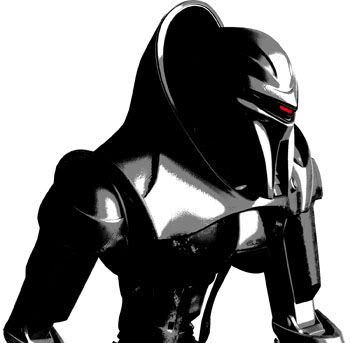
As you can see, there are still fuzzy areas that will need to be fixed when the image is vectorized.
Link of the day:
Flickr's Dirty Little Secret
Labels: Photoshop
(more...)permalink | (0) comments
Vector Branch
12:15 AM
Arrrgh! This one was frustrating to do because Illustrator kept crashing on me. What probably would have taken me half an hour probably took me three times as long because of this.
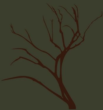
This isn't supposed to be a complete piece by itself. I just thought that I would create some stock vector elements that would go with a bigger project.
Link of the day:
50 Remarkable Favicons
Labels: Illustrator
(more...)permalink | (0) comments
Mini Icons
Monday, January 29, 2007 2:32 PM
I worked a little bit today on an update for the CHSC website (screenshot). It occurred to me that the little icons that I make for the featured updates might be little minor things that most people don't really notice, but it really spices up the page. Besides, I think I spend too much time on it than I need to. Anyway, I thought I might showcase some of my favorite little icons for this entry.
The idea, of course, is to relay some information through the icon while making it eye-catching enough for people to read the headline. Sometimes I make the icons generic enough to warrant re-usage, but there are some (like the Texas one) that are too specific to use again.
For the update today, if you look closely at the screenshot, I made the little crown. It actually took me a while to make it, mostly because I'm still a bit new to Illustrator, but I think it turned out all right in the end.
Link of the day:
The Best of 2006 Logo Trends
Labels: Web Design
(more...)permalink | (0) comments
Conscious Realism Poster
Sunday, January 28, 2007 4:49 PM
Here's a poster that I made for the UCI Philosophy Club.

It's simple enough. I think of it as an exercise in organization in typography. Trying to get the important message out without losing aesthetics, or losing focus on what the event was about. I also learned a little more about InDesign's abilities through this exercise.
Link of the day:
Creating grunge brushes
Labels: Type
(more...)permalink | (0) comments
Ethereal Water Lily
Friday, January 26, 2007 1:01 AM
Egads, this one took me a lot longer to do than I anticipated. It came out pretty much the way I anticipated, which is good. I was trying to make a ghostly feel to the flower. I think it worked.

Here is the original stock photo I used to make this piece. This piece can also be used as a desktop wallpaper, if you so desire (I have up to 1600x1200 for it, though the actual lily itself is bigger than that).
There's a bit more negative space than I would have liked when I put it in a wallpaper-sized canvas. Perhaps in the future I might think of something to add to it. As it is, however, I'm pooped out, and I need to devote some time to do my homework.
Link of the day:
CSS Printing Guide
Labels: Photoshop
(more...)permalink | (0) comments
Nova
Wednesday, January 24, 2007 2:42 PM
Here's another abstract piece. I actually started out being more abstract... I didn't even know what it was I was making until the last leg of it.

Basically, I just started out with the spiky-disco-ball-thing, and it eventually just turned into a galactical piece. Heh.
Link of the day:
Quick CSS Mockups with Photoshop
Labels: Photoshop
(more...)permalink | (0) comments
Pop Art with BSG's Six
Tuesday, January 23, 2007 1:34 PM
I'm pretty good at Photoshop. I've been using it for over 5 years now, and I've become very comfortable with it... almost to a fault. I'm pretty familiar with a majority of the program's tools, except for the pen (among some others). I've always found the pen to be anti-intuitive, at least compared to actual vector programs, like Illustrator and InDesign (to some extent). So I decided to take up on getting used to the pen in Photoshop. I was going to start by making line art, but I decided to start off more simply, with just the general shape.

I thought that Number Six would be a good figure to work on. She has great curves (obviously), and her hair would make it much more challenging. In the end, I think the silhouette turned out pretty good, but I could probably use more practice with the tool, especially if I want to use it for more a more complicated composition. Eventually, I suppose knowing how to use the pen tool would be very useful in making those faux vector arts on Photoshop.
The link listed below was very useful in helping me get a handle on the pen tool, and it also inspired this piece.
Link of the day:
How to use Photoshop's Pen Tool
Labels: Photoshop
(more...)permalink | (0) comments
Whirl
Monday, January 22, 2007 11:45 AM
Here's a follow-up to my previous abstract piece. What's my fascination with water recently? Who knows.

This one isn't as good as my last one. It's too simple without saying anything. I think I still need to get to know Illustrator better.
Link of the day:
Grunge Vector Shirts
Labels: Illustrator, Photoshop
(more...)permalink | (0) comments
Pattern #3
Sunday, January 21, 2007 11:57 AM
I decided to have a go at a non-tessellating pattern this time. It was quite tedious, but I think it came up with an interesting pattern.

It was made from a series of intersecting circles. I would have put a more interesting design within the circles themselves, but I didn't have time to play with that today.
Link of the day:
53 CSS Techniques You Couldn't Live Without
Labels: Patterns
(more...)permalink | (0) comments
Patterns #2
Friday, January 19, 2007 1:53 PM
Here's another go at making patterns. This time I decided to go with a circle-esque pattern.
 Fish scales! No?
Anyway, I think compared to the previous pattern, it definitely leaves less negative/white space, which makes for a better, busier looking pattern. Last time, I think that it looked too blocky and unchallenging (though I think the diagonal tessellation helped a bit), but this design looks much more fluid when it becomes less concerned with straight lines. The combination of convex and concave lines/shapes has an appealing effect on the overall pattern.
I am a little unhappy with the half-circle design. It has an abrupt end at the bottom of the half-circle, which I think I should have dealt with better. As soon as I realized the problem, I tried adding a stroke on the bottom of the inside design to make it look less truncated, but I think in the future I should try and make it blend into the next row better.
Link of the day:
Create a Bouquet Using Illustrator's Polar Grid Tool
Labels: Patterns
(more...)permalink | (0) comments
Ripples in the Sunset
Thursday, January 18, 2007 1:34 PM
Here's an abstract piece I did. I tried to minimize it down to shapes, but it did end up turning a little Family Circus-ish.

The image is 1440x900, so it can be turned into a wallpaper if you have that resolution. [Edit: It was resized down in Flickr to 1024x640. Sorry.]
Link of the day:
IE and the CSS Box Model
Labels: Illustrator, Photoshop
(more...)permalink | (0) comments
Version 1.1
Wednesday, January 17, 2007 11:53 PM
Because someone has complained about the unrealisticness of the grass in the original banner/header of this blog, I modified it a little to look more grassy. Or furry. Pick your poison.

Link of the day:
7 Habits of a Highly Successful In-house Web Designer
Labels: Photoshop, Web Design
(more...)permalink | (1) comments
Sun & Snow Illustration
Tuesday, January 16, 2007 1:04 PM
I figure that I haven't been doing a lot of illustrations. I like doing them, but I have a hesitation in making such compositions because 1)I have low confidence in my abilities to draw and 2)drawing complex objects can be difficult without a Wacom tablet. But hey, a girl has to start somewhere.
 This composition was sort of inspired by the recent bout of cold weather we've been having here. It's almost always sunny during the day, but frelling cold at night. Not that it snows down here in sunny California, but it does feel very nippy late at night. It's also inspired by a cover I was doing for my school newspaper that never made it to finals. This was mostly due to the fact that we didn't have pictures for the event (which was an art exhibit on weather) at the time I was making the cover, so I was forced to make a cover in case the pictures never came in before having to put the newspaper to print. Of course, we did receive the pictures in the end, but it also meant scrapping my illustration. Oh well.
Link of the day:
Color Palette Generator
Labels: Illustrator
(more...)permalink | (0) comments
Type Logo #2 - Web 2.0'd
Monday, January 15, 2007 2:32 PM
Eeks. I don't have a lot of time today to do anything complicated as I am bogged down by much homeworks, so I decided to play around with my previous project.
 Now I don't usually subscribe to going full-on with the Web 2.0 cliches and whatnot with my graphic and web stuff. It was great to see the pretties when it became a trend, but I think it's been beaten down to a pulp by now. Of course, the elements within these Web 2.0 logos is still relevant, as it was before the trend, but to have all these in excess really makes the "simple glossiness" nauseating when you start seeing it everywhere. Anyway, I shall stop dissing my own logo now.
Obviously, I don't call myself a Web 2.0 design expert, but I think its style is not difficult to capture. So, here it is, in my logo. I think this Web 2.0-ization of this logo works because it is already blocky and independent of each other, and didn't have the antique feel of the serifed-swishiness of my first attempt. I made the "W" of an orange gradient (rather than the original yellow color) because I didn't think green and yellow worked as well on it.
Link of the day:
Corporate World Meets Web 2.0
Labels: Type
(more...)permalink | (0) comments
Type Logo #2
Sunday, January 14, 2007 4:38 PM
Here's another attempt at a logo containing my initials. This version is inspired by my loveable boyfriend.
 This was again done in Adobe Illustrator, using some Before & After tips. I like this version better. It looks more modern. It took me a while to make all the angles and lines fit together, especially trying not to let the W take up all the space, and I think it looks pretty balanced in the end.
Link of the day:
Whitespace
Labels: Illustrator, Type
(more...)permalink | (0) comments
Tablecloth Pattern
Thursday, January 11, 2007 11:44 PM
This was a challenge posed by my boyfriend. The idea is to apply the pattern from a previous post and make it into a convincing tablecloth pattern. Not a simple task (for me, at least), accounting for creases and different planes that the tablecloth will lie on.
This beautiful photo is from Editrix:

It took quite a bit of manipulating, but here's the final result:

It's not as convincing as I would have liked. The top of the tablecloth seems a bit off in terms of perspective. I think I may have stretched it too much vertical-wise.
Link of the day:
Sliding Doors of CSS (more...)
permalink | (3) comments
Type Logo
Wednesday, January 10, 2007 1:14 PM
As a graphic artist without formal training, I don't feel that I have a lot of experience in typography. Sure, I know the basic terms, such as serif, tracking, leading, ascender, etc., but I am still an amateur on how to apply these concepts in coherent, artistic ways. But I guess that's what this blog is all about.
 I thought I might start out my exploration of this topic with making a simple type logo with my initials. What is not so simple, however, is the awkwardness of my initials (DW). They don't have a simple, easy solution for coming together. It would have been a simple solution, I think, to make the two letters share a line/curve, and that was my initial idea starting out. But the curve on the D is a little too round to make the W fit in. Before & After has a great overview on dealing with such an issue (and they even use my initials!), but I wanted to try something that didn't rely on color for now to be coherent.
Link of the day:
ColorBlender.com
Labels: Illustrator, Type
(more...)permalink | (0) comments
Making Patterns
Tuesday, January 09, 2007 12:26 PM
Tessellating patterns have always been an interesting problem to me. Usually, when I want something to tessellate, I'd just be lazy and use Flaming Pear's Tesselation plug-in. However, it doesn't allow for complete control over how you want the image to tessellate, and how it looks like in the end. Besides, I find wallpaper-like patterns to be more interesting and challenging. It's a step away from relying on stock images, and I would like to see my graphics have more elements of my own making.
 I used Illustrator to create the pattern and Photoshop to complete it (symmetrically) and then tessellated it.
It's nothing special or complicated. Heck, it only has two colors. But it's a start on thinking about the problems and challenges in tessellation.
Link of the day:
Website Header 2.0 (Part 2)
Labels: Illustrator, Patterns, Photoshop
(more...)permalink | (0) comments
TUTORIAL #1: Photorealistic Coffee Stain in Photoshop
Monday, January 08, 2007 11:23 PM
For the first tutorial, I'm going to stick with something easy and simple. And like all the tutorials hereafter, I'm going to assume that anyone interested in reading this has some working knowledge of Photoshop, so I won't go into the finest details about the basics of the program.
I first came across this idea when I was creating a photorealistic montage for UCI's handbook contest last year. The idea was to create a top-down view of a typical student's desk. I was going to put an empty mug on the side of the desk, but I had a hard time making a convincing one (perhaps a project for the future), so instead I thought that a coffee stain could do just was well. (Maybe it could even be a subtle statement about how messy we college students are, heh)
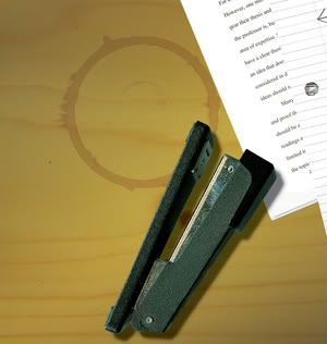
We'll need to start out with a surface. This one will do (or you can use your own):
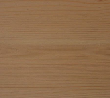
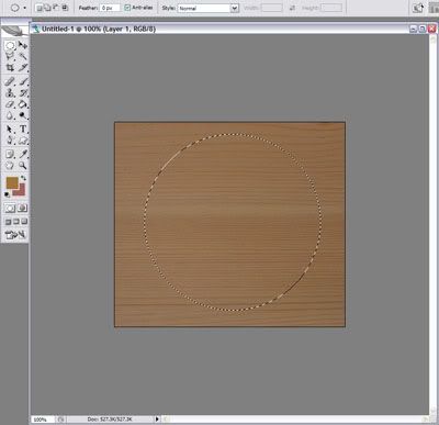
Now, create a new document with the desk surface. Create a new layer and use the Elliptical Marquee (m or Shift+m) tool and drag out a circular marquee on the canvas in this new layer. You can keep it circular by holding down Shift key when you click and drag.
On your menu toolbar, select Edit -> Stroke to get the stroke dialog box. Select a width of 20px (this will vary according to how big you want the coffee stain to be), and choose a color. In this instance, I chose a light brown (we'll see why in a second): #D0A259. Please keep in mind that the color you choose will be different if you have a different surface that you're working on. Choose Center for the location of the stroke.
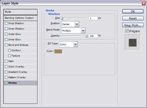
You should have an outline of a circle now. Put the layer on Multiply blend mode. The color of the outlined circle should look more coffee colored now. Double click on the layer (or right-click on the layer and select Blending Options...) to bring up the Blending Options dialog box. Select Stroke on the left panel (it should be the last style option). Position the stroke on Center and set the Blend Mode on Multiply. Select a color that is darker than the previous outline: #A9855A.

This step is to simulate the liquid accumulating toward the edges of the rim outline. Whenever we manipulate the shape of the stain, the stroke should follow the shape.
Select the Smudge tool (r or Shift+r). Make sure you have a hard brush selected at about size 8-10. Also make sure that the strength is at 100%. Now, on the outer rim of the circular outline, start pushing out some bumps to simulate drips on the side of the mug. Don't overdo it, we just want to get rid of the unrealistic perfect circle shape.
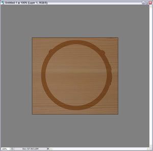
Now, select a soft brush at size 8-12 and lower the strength of the Smudge tool to 60-80%. Select the brush palette (on the top right corner) and select Shape Dynamics. Change the Control option to Fade. Enter 15-30 next to the Control option. Now slowly scuff out an edge, repeatedly drawing out some of the stain. You may want to change the brush size and/or size of the Fade while doing so. This is to simulate a careless dragging off of the mug, brushing the stain in that direction.
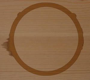
And voila. To improve upon the example above, you could remove part of the stain outline, to have a partial stain. Or you could make the shape of the stain more irregular. By itself, it looks rather banal, but with other elements, it could really make a difference in a composition.
Link of the day:
Create a Realistic Gas Flame in Photoshop
(more...)
permalink | (0) comments
First Post and Introduction
Sunday, January 07, 2007 2:49 PM
Welcome to my blog! My purpose for starting this blog was to 1)explore graphic/web design on my own and 2)to keep me on track for doing so. My goal is to publish something on a regular basis (say 5 posts per week) with projects (large and small) showing my progress and/or product in graphic design, web design, and web programming. My first post's project, then, is pretty much just the layout of this blog.
But first... introductions are in order. I'm currently a student at UCI, studying Film & Media Studies (they don't have a graphic design major here). I've been doing web and graphic design since the summer of 2000, when I first started learning HTML, and had to use some graphic programs to make web pages. Eventually, I got into making fanart wallpapers (which I still make to this day) for various TV and movies, and that of course spanned into learning graphic design in particular. It was only somewhat recently that I decided that I could make my hobby a professional thing. While I have always had an interest in it, I wasn't sure I could turn it into a career. In fact, I am still not sure if I can, but I decided to pursue a career path that I know I can enjoy and be happy with. I'm largely self-taught, especially in the area of web design, but I have taken a few classes that have helped me further my interests, like Macromedia Flash class. Otherwise, I try to keep myself up-to-date with the latest web news and trends by myself. To tell the truth, however, I only realized there was XHTML about a year ago, so, yes, I can be behind the times a bit (or all the time). I am currently trying to learn Javascript, and hopefully eventually I will learn PHP.
 As for the design of this blog... I was trying to think of something that would fit the theme of this blog. A field of flowers seemed to resonate a kind of theme of thoughtfulness, and I added the moon because it relates to my name, and adds a kind of surrealness to the illustration. I created it entirely in Adobe Illustrator. It's actually the first illustrated composition I've officially done on that program, since I am kind of a newbie at it. It took me a couple hours to put the composition together, and then another few hours to make it into a comprehensible layout. Unfortunately, I'm lazy, and I've only made sure that this entire layout actually works in Firefox and Internet Explorer. I'll be sure to check it in other browsers, however.
All in all, I'm disappointed that I had to start it on blogspot, but I don't currently have any other home for it, so it will have to stay a bit small for now until I can find/buy a home for it.
Link of the day:
Swirly Curls in Adobe Illustrator
Labels: Illustrator
(more...)permalink | (0) comments
